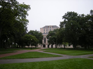
 The Main Library. That's what I always called it. "I'm going to Main to study", "I've got to pick something up at Main", "Main's got a copy on reserve". In its day the name fit like a glove. The Main Library was just that...the main library. It was big, utilitarian, servicable, and not much else (think main post office, main bus depot, main terminal, etc.).
I point this out because I'm pretty sure that's what everyone called it. So I was more than a little surprised when I visited the newly renovated Main Library only to find out it's not called that anymore...at least not officially anyway. Apparently there's a new brand in town (and if you're one of those people that has never gotten used to "THE" Ohio State University then I'm afraid you're probably not going to like this either). According to the still warm and inky smelling visitor's guide (and OSU's own web page) we will henceforth and into the future refer to the tall library at the west end of the Oval as "The Thompson Library".
Now, before you roll your eyes and run for the familiar comforts of cynicism, consider this: It fits. The name fits. How? you might ask. Did you notice how "The Thompson Library" sounds sort of di
 gnified? Well, the new library is sort of dignified. And did you notice how "The Thompson Library" sounds sort of stately, even a little old school? Well, the new library is kind of stately, and even a little old school. The Grand Reading Room is a perfect example. It's been brought back to it's early 20th century splendor in a way those of us who toiled under the old version of this building could never have imagined. (There's even a copy of "Winged Victory" on hand to remind us (presumably) of our indebtedness to our Greek forebearers and the importance of a well-rounded and Classical education.) Which isn't to say the whole building is some kind of Gilded Age throwback, because it's not. There's enough glass, exposed structural elements, and sleek lines to keep the modernists happy too.
What I think will strike most visitors is the way it all works together; old and new, books and computers, form and function. The old building never really acknowledged t
 he collection. The stacks eventually became a kind of eleven story basement (if there even is such a thing) while more and more computers were pushed to the front of the building. Now I'm no luddite, and I'll be the first to acknowledge the role of technology in libraries (critical!), but the fact is the library's "brand" remains books.
Happily, the architects, librarians, administrators, and other smart people involved in this project seem to have understood this. The collection, rather than being hidden from view, has become a focal point, a source of pride even (think of bookshelves in your home). The stacks - the very books themselves - are on display in a kind of multistory bookcase that simultaneously inspires and humbles. Walking through the lower floors, the building behaves as if everything revolves around this towering collection of books. In a way, it does. The library remains a vehicle by which we can store, organize, and retrieve information, and while computers have their place, there's nothing that illustrates the organization of information quite like thousands of books ordered on a shelf.

And if that's not enough to make you want to visit "The Thompson Library" I'll recommend a trip to the top floor of "the Tower". This formerly dingy recess of a space has been converted into what amounts to an elegant reading room/observation deck (complete with wood paneling and comfy chairs). The views are terrific from any point on the compass, even on the grey morning I visited.
Congratulations to OSU, OSU Libraries, the Architects, and everyone else involved in this project. It's a great building, and one that's certainly worthy of the name!

Looks beautiful. I can't wait to visit. I remember those dingy, creepy 11 floors of "basement." Thanks for the post!
ReplyDelete